THE COLOR NOTEBOOK / COLOR EXPLAINED
Hue, Saturation & Brightness: A Practical HSB Guide
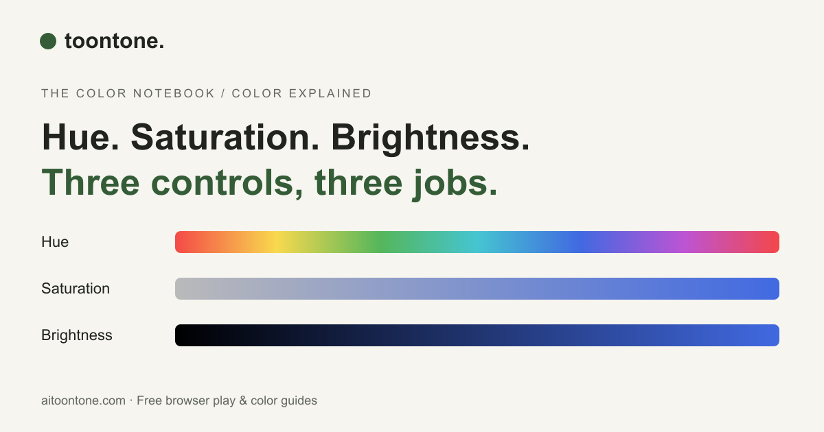
The three sliders are easier to use when each one has a clear job. Start with the family, adjust the intensity, then check the brightness.
HSB stands for hue, saturation, and brightness. It is also commonly called HSV, where V means value. Our daily color practice uses this model. HSL uses hue, saturation, and lightness; its third control behaves differently, so an HSB value cannot be copied directly into an HSL control and expected to look the same.
Hue: where are you on the color wheel?
Hue is an angle around a color wheel. Red lies at 0°, yellow around 60°, green around 120°, cyan around 180°, blue around 240°, and magenta around 300°. The wheel wraps around, so a red near 359° sits close to a red near 0°. Moving hue changes the color family while the other settings stay fixed.
For a color between two families, ask which direction it leans. Is that blue slightly greener, or slightly more violet? This makes small corrections more deliberate than sweeping the entire slider.
Saturation: vivid or grayish?
In HSB, 0% saturation removes the hue and produces a neutral gray at the selected brightness. At 100%, the selected hue has its strongest saturation for that brightness. If a remembered pastel looks too intense, reducing saturation is often a sensible first experiment.
Brightness: the HSB value
At 0% brightness, every hue becomes black. Raising brightness increases the highest RGB channel. At 100% brightness and 100% saturation, the result is a vivid color, not white. To reach white in HSB, set saturation to 0% and brightness to 100%.
| Control | Useful question |
|---|---|
| Hue | Is this the right color family? |
| Saturation | Is it too vivid or too gray? |
| Brightness | Is it too dark or too bright? |
Why lightness is different
In HSL, 0% lightness is black and 100% lightness is white, regardless of hue or saturation. A fully saturated hue sits at 50% lightness. By contrast, HSB at 100% brightness can still be a strong, saturated color. This difference explains why identical-looking slider numbers in two tools can produce different results.
A simple adjustment order
First pick a hue, then adjust saturation, then brightness. Recheck the hue at the end, because changes in brightness and intensity can affect how a shade appears. The order is a practice aid, not a guarantee of a perfect match. Different screens and lighting conditions also change the viewing experience.